

Even a cherished wall display can eventually grow stale or outdated, signaling it’s time to retire the old and clear the space for a fresh presentation. When crafting a new focal point—especially a collage of multiple prints—careful planning is key to creating a cohesive and visually stunning arrangement. This guide will walk you through the entire process, moving from general design principles to practical applications using photography from AzarÉl Greetings. I might be a tad biased toward these images, but it’s hard not to be when the subjects are the wild birds and quirky critters in our own backyard, all caught involved in delightfully surprising antics.
The simplest way to create color harmony is by choosing a specific palette category:
If you choose a vibrant collection, make sure there is a consistent level of saturation across all prints. The unity in your vibrant display can be established by finding a single color that consistently splashes across all the prints. Crucially, allow for enough neutral space between the prints to give the viewer’s eye a rest, preventing the colors from becoming overwhelming.
2. Thematic Cohesion
A common thread in your subject matter—the theme—is the other anchor for a cohesive display. Many homes revolve around themes like family, travel, or beach/coastal life. Even abstract elements, such as vintage objects or a simple focus on nature, can serve as a theme. This emotional connection links even the most diverse prints together.
3. How AzarÉl Greetings Unifies Color and Theme
AzarÉl Greetings‘ photography already gives you a significant head start on both color and theme cohesion elements:
Now that your prints are cohesive, it’s time for the fun part: picking your layout! The most practical starting point is to consider the design based on the number of canvas prints you have.
This method, which focuses on panel count, is the foundation for the visual guides offered by many print specialists (including Easy Canvas Prints). We’ll dive into several examples below, beginning with the most basic arrangements.
The Two-Print Layout: The Buddy System
Grouping two prints creates a look that is definitively balanced and modern—a perfect “Buddy System.” You have a few simple options:
Horizontal Line: Place them side-by-side with a consistent gap of 2 to 4 inches. This works beautifully over a sofa or bed and makes the wall feel wider.
Vertical Line: Stack them one above the other. This adds height and is perfect for a narrower wall or next to a doorway.
Diagonal Placement: This is a less conventional, but dynamic, choice. Placing prints on a diagonal breaks with strict formality, adds visual movement, and introduces an element of creative energy.
For a beautiful, balanced pairing, I often recommend AzarÉl Greetings prints like “Baked with Love” and “Life is Measured,” as they share complementary colors and a similar thematic feel of quaint, measured moments.

The Three-Print Layout: The Rule of Odds
If you have three prints, you can immediately take advantage of the Rule of Odds. An odd number of elements creates a more organic, collected, and less-staged feel than an even grid. Three is the smallest number that creates a pattern our brains find satisfying—it’s just enough to feel cohesive without looking cluttered.
For an immediate, powerful effect, try the three-panel horizontal layout. This simple row is a natural fit for spaces above sofas or credenzas. Consider using a triptych—a single, stunning image split across all three panels. This is “Lard Bucket Bouquet” without a quote. Consider choosing a short quote from our blog, “Make it Yours!”

If you prefer variety, use three individual photos unified by their color or theme. These can be arranged with the dominant piece in the center, flanked by the two smaller ones in a “wingman” look. Horizontal layouts are natural fits for spaces above sofas or credenzas. Below, the greens and purples of “Amazed by Grace” (20″x30″), “Be Still” (12″x18″), and “Tiny Little Visitor” (12″x18″) combine beautifully. It’s a beautiful example of cohesive color and theme.

Below is another common, and highly effective way to combine a large print with two smaller prints. “Embrace the Moment” (portrait with horizontal flip), “Smiles of Nature” and “Music Gives Wings” all have pops of blue and orange or yellow. (Please request the vertical version of “Embrace the Moment”.) It’s a beautiful theme of birds in nature. The large, central piece grabs attention, while the smaller pieces—each with similar color stories—support the main visual.

The Four-Print Layout: Embracing Whimsy
For four prints, the easiest and most polished look is probably the 2×2 grid. This is a very formal arrangement: four canvases arranged into a perfect square or rectangle with consistent spacing.
While this structured look is beautiful, I personally often resist it. Instead, I like to display sets of four AzarÉl images in an off-kilter or circular arrangement that keeps the eye moving from one print to the next. Arranging the four chipmunk photographs in a dynamic, slightly asymmetrical cluster allows the viewer to absorb the whimsical narrative of each piece while still enjoying the overall flow. These sweet little chippies, starting in the upper left corner are: “Sunny Daze”, “A Nose for Roses”, “‘Rainy Day’ Sun-brella”, and “Peanuty Smile”. You may wish to substitute “Pumpkin Delights” for one of them.

How do your feelings differ as you look at Seasons of the Canning Jar below? The left is more formal and organized. It moves the eye around the circle as well as emphasizing the vertical. (These are four 12″x18″ giclée canvas prints.) The right is a more casual grouping that keeps the eye moving in a circle while adding a little bit of width. (These are four 11″x14″ giclée canvas prints in a combination of vertical and horizontal.)
Seasons (left): “Belle of the Ball” (Spring-catbird), “Dancing on Sunshine”, “Autumn Delight”, “Toasting My Toes”
Seasons (right): “Dancing on Sunshine”, “Belle of the Ball (Spring-Robin), “Autumn Delight”, “Belle of the Ball” (Dove)

Perhaps you’d like to use the same giclée canvas prints in a more horizontal arrangement above a sofa or credenza. Many things in décor are simply a matter of preference. It’s handy to refer to a visual guide when making these choices. The “Seasons of the Canning Jar” in the collection below include:
“Toasting My Toes”, “Belle of the Ball” (Spring-catbird), “Dancing on Sunshine”, “Autumn Delight”.

Creating a captivating wall collage comes down to effectively managing two elements: color consistency and thematic cohesion. By choosing layouts based on the number of prints and varying the size of your canvases, you can guide the viewer’s eye and maximize impact. Using a visual guide is an incredibly handy tool. See one here.
If you happen to select AzarÉl Greetings photography, you get a “leg up” in the design process. Our prints are already tied together by inherent vibrant color palettes and a unifying theme of backyard whimsy.
To make your design even easier, if you’d like to see a specific collection of AzarÉl Greetings canvases displayed together, I would be more than happy to create a free mock-up for you. It’s easier to play around with sizes and different arrangements when you can actually SEE it. Call me at 717-844-9949. Let me help you visualize how your favorite AzarÉl images combine before you hang the very first panel!


Original Photography

Giclée Canvas print, 20” x 30”
Original Photography, printed and hand stretched by AzarÉl Greetings.
Click here to see how our canvas prints are made.
| 1000 Left in Stock | ||
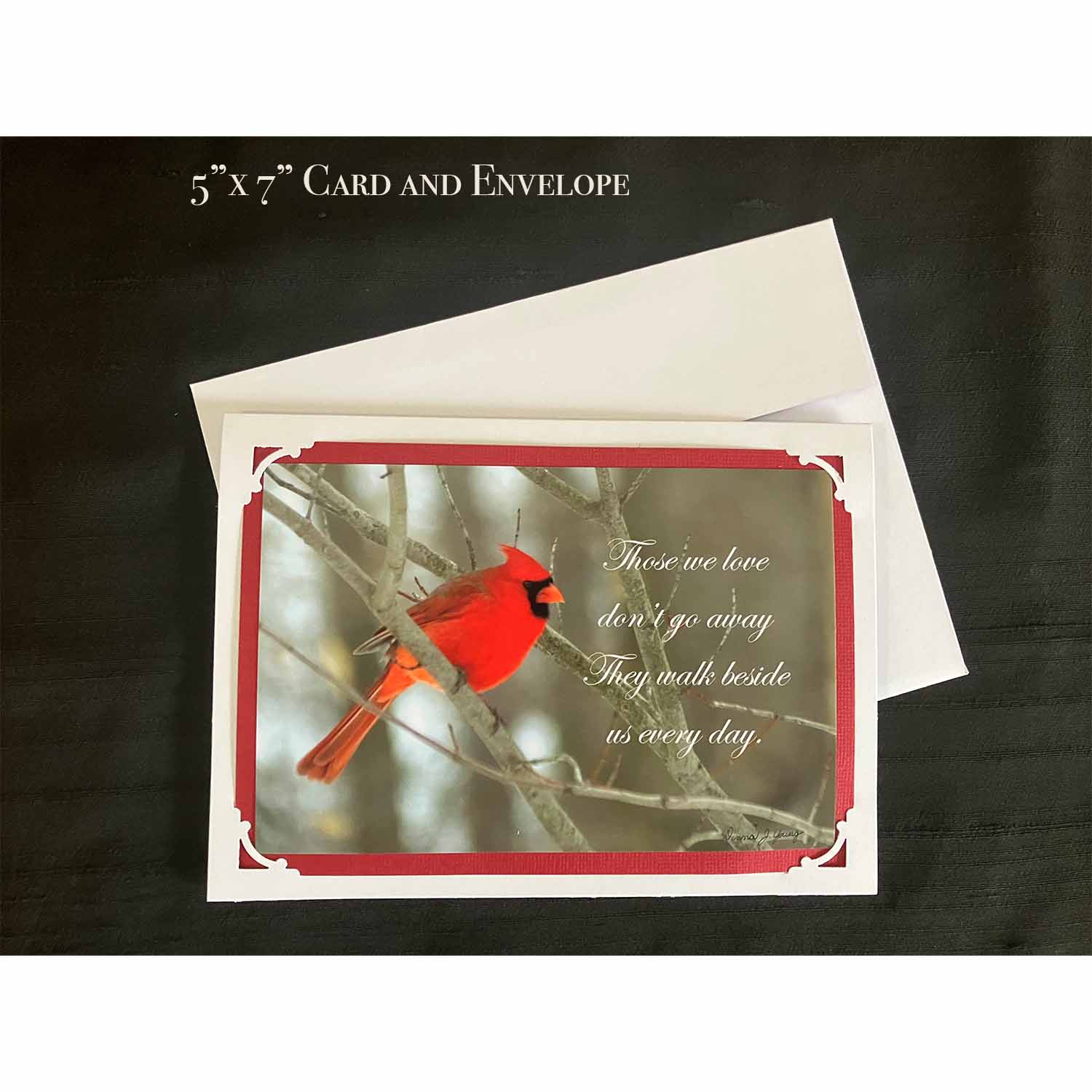
5" x 7" handmade greeting card, Original Photography
| 988 Left in Stock | ||
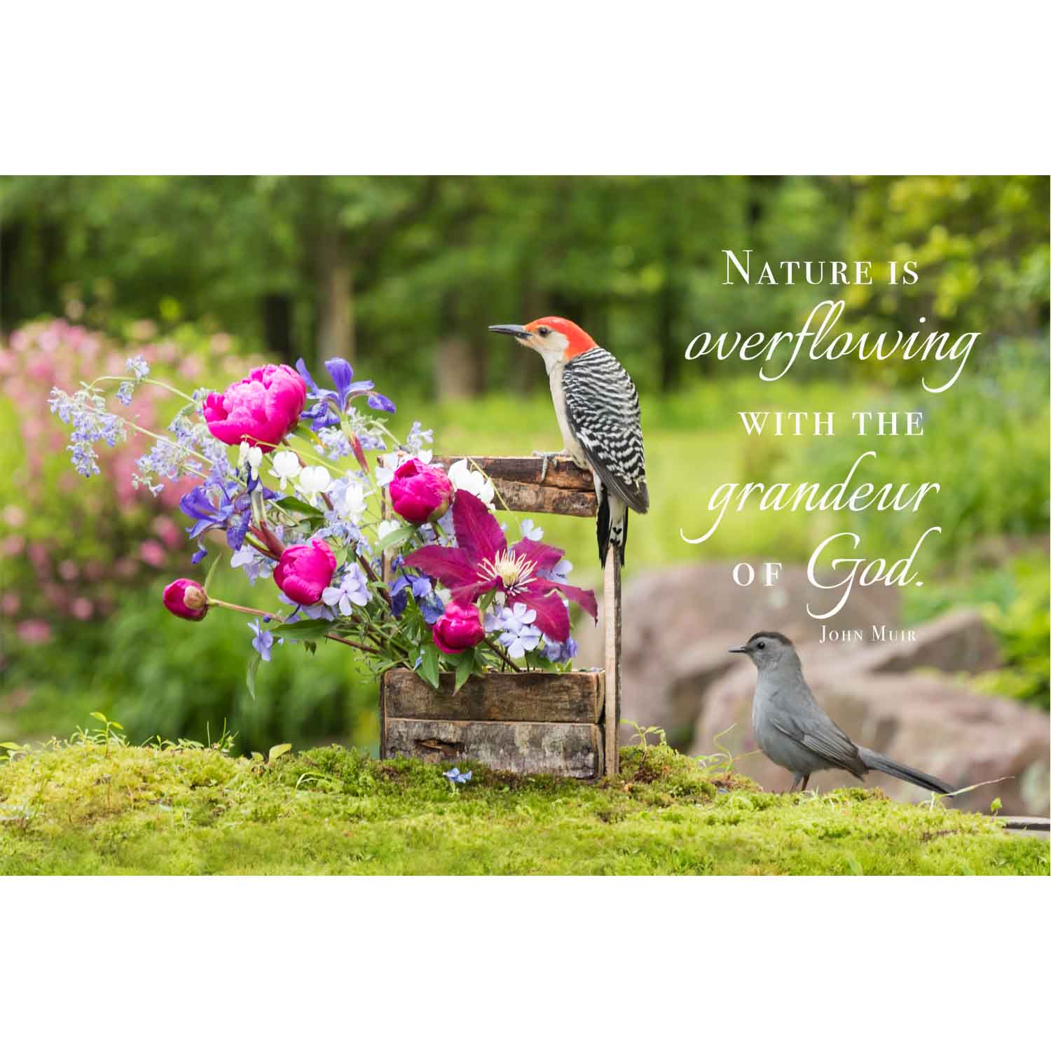
Giclée Canvas print, 20” x 30”
Original Photography, printed and hand stretched by AzarÉl Greetings.
Click here to see how our canvas prints are made.
| 3000 Left in Stock | ||

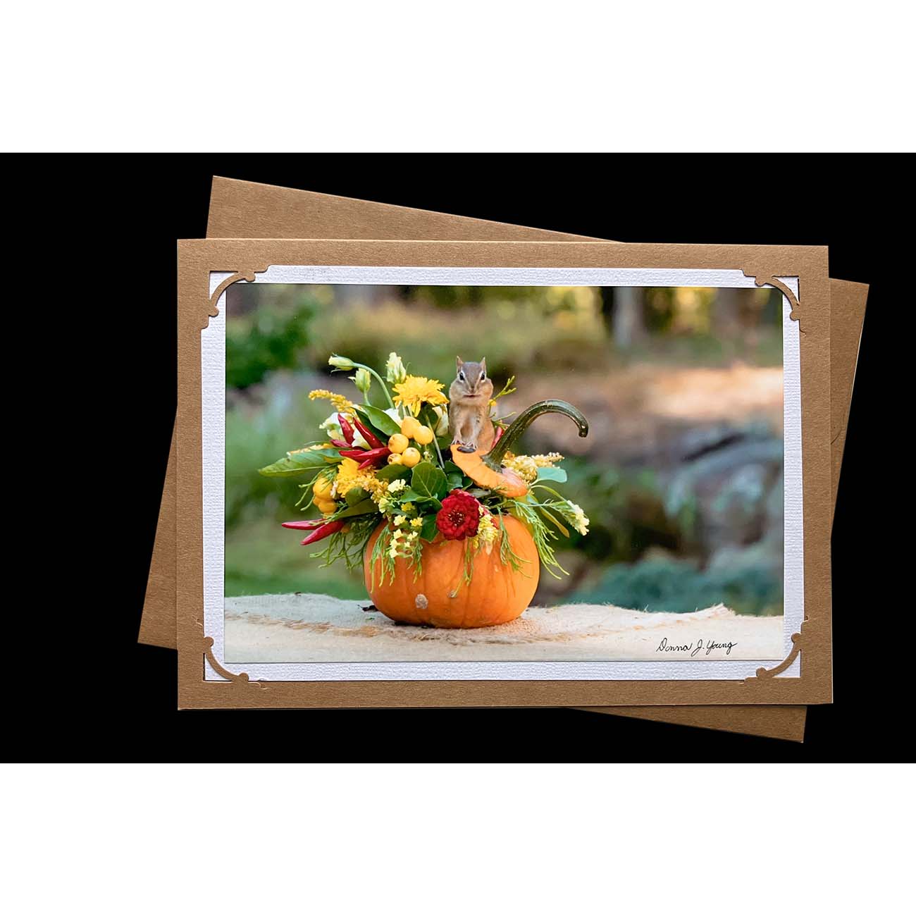
Original Photography
| 999 Left in Stock | ||

Original Photography
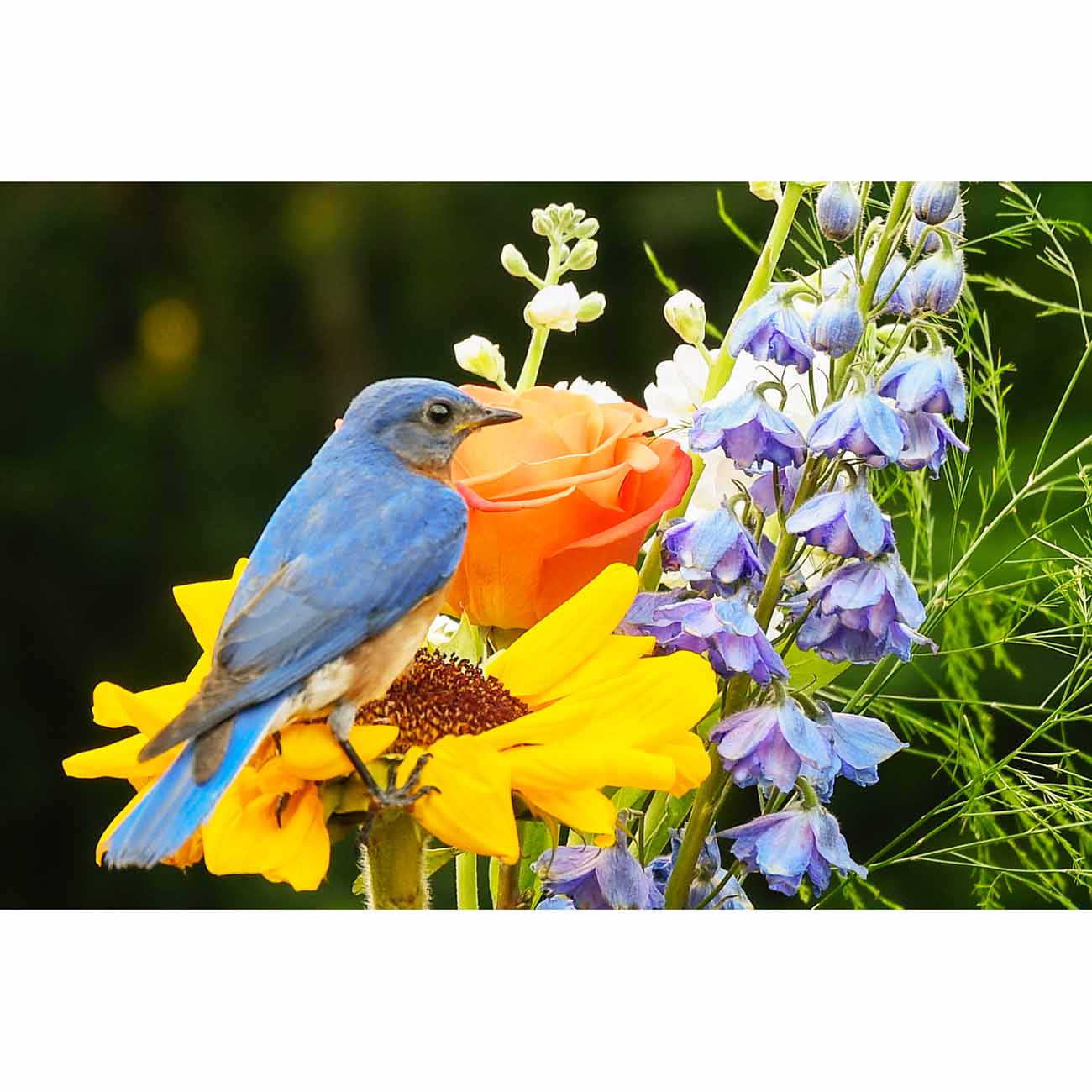
Giclée Canvas print, 16” x 24”
Original Photography, printed and hand stretched by AzarÉl Greetings.
Click here to see how our canvas prints are made.
| 3000 Left in Stock | ||

Giclée Canvas print, 16” x 24”
Click here to see how our canvas prints are made.
| 1000 Left in Stock | ||

Giclée Canvas print, 20” x 30”
Original Photography, printed and hand stretched by AzarÉl Greetings.
Click here to see how our canvas prints are made.
| 3000 Left in Stock | ||
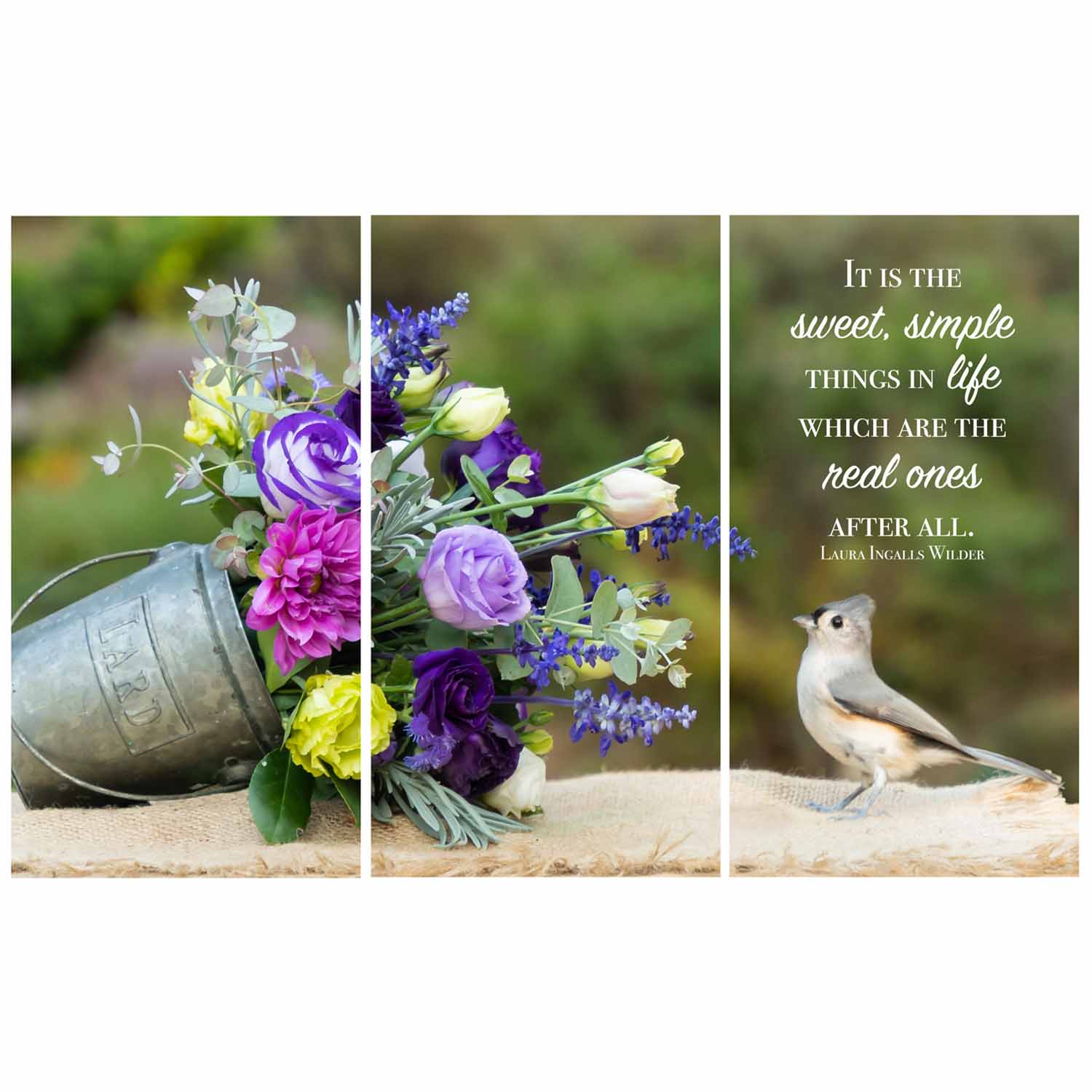
Giclée Canvas print, three panel triptych, 30" x 49 1/2" (w/ 3/4" gaps)
Original Photography, printed and hand stretched by AzarÉl Greetings.
| 3000 Left in Stock | ||


Original Photography
Click here to see how our canvas prints are made.
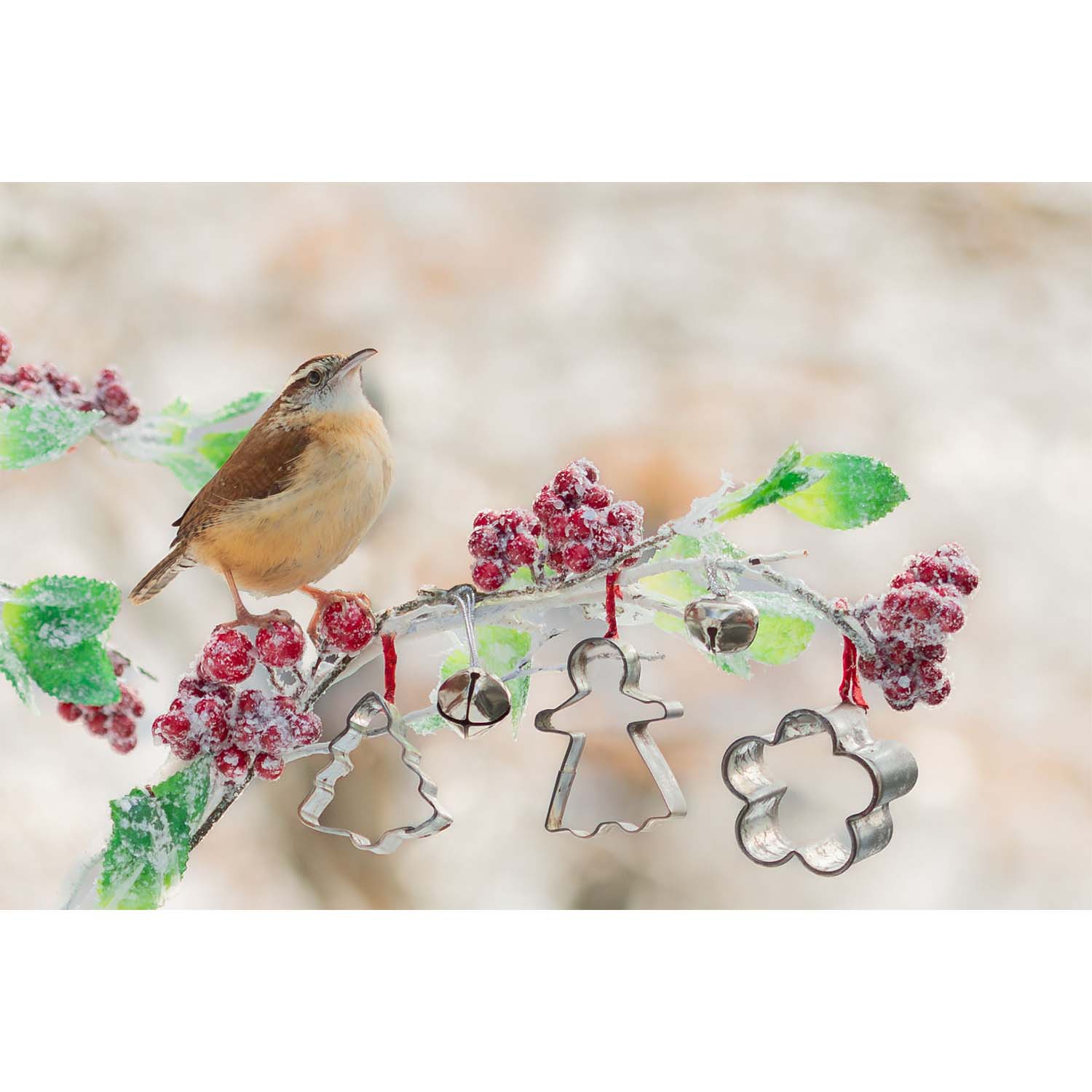
Giclée Canvas print, 16” x 24”
Original Photography, printed and hand stretched by AzarÉl Greetings.
Click here to see how our canvas prints are made.
| 3000 Left in Stock | ||
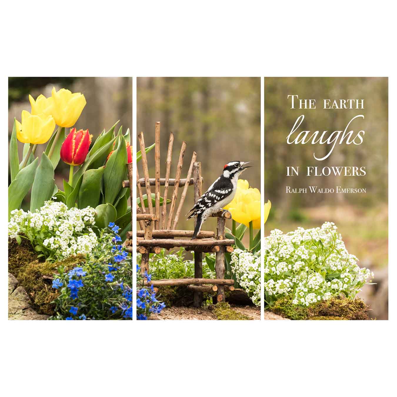
Giclée Canvas print, three panel triptych, 20" x 33" (w/ 3/4" gaps)
Original Photography, printed and hand stretched by AzarÉl Greetings.
| 3000 Left in Stock | ||